Friday, 29 April 2016
Wednesday, 27 April 2016
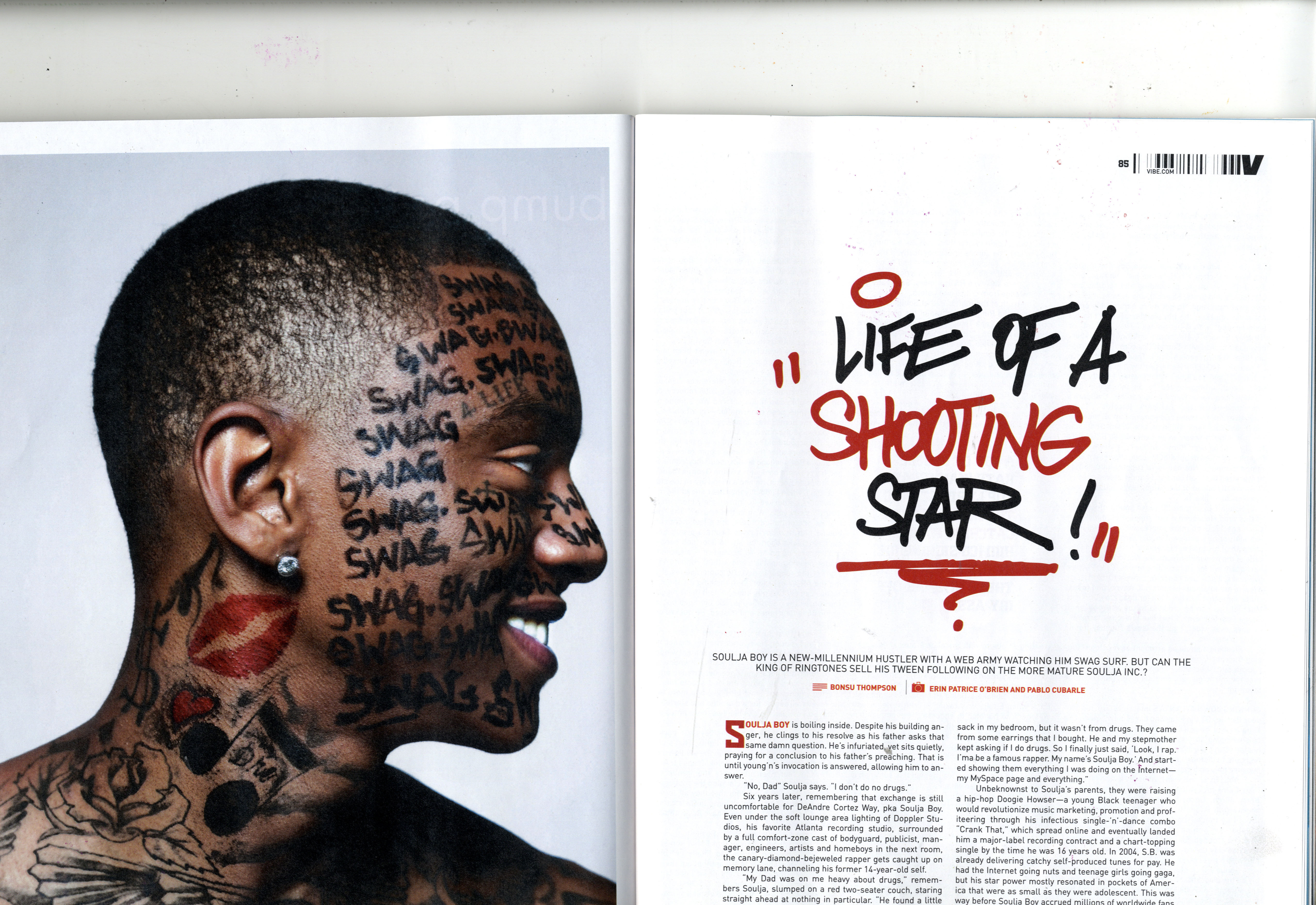
Final complete version of the double spread page.

-since my previous update I have improved the double page spread by deleting the excessive amount of quotes on the page to make the page appear less cluttered and more professional. I have also ensured that the font style and sizes of the quotes are different to the previous ones ass the previous ones I had were not very aesthetically pleasing and ruined the whole house style of the page as it degraded it.
-I chose to use the font colour red and a black background to show the audience the importance of the presence of the quotes hence, the large bold font sizes they appear in..
- To enhance the quality of the construction of the page further , I rearranged the positioning of the articles in columns to help make the contents on the page look sharp and presentable to the audience.
Friday, 15 April 2016
Almost complete version of the double page spread.

Although this update looks complete, from the feedback I had from my target audience, and other people, I noticed that the quotes on the page were too many and looked cluttered making the page look un professional. For this reason on my next update I will reduce the amount of quotes on the page as I believe that it will be less distracting for the reader and they will focus on the article rather than the quote. The font style of the quotes will be also changed into a bolder font style which will make it more aesthetically pleasing to the eye as they will be able to easily read it. The main image on the page does not look professional as the image appears to be "stretched out" making the image be of a poor quality. For tis reason on my next update I will make sure that I re-take a photograph of the model/artist in the same costume and posing in the same position, with the aim of improving the quality of the image.
Thursday, 14 April 2016
Almost completing the double page.

-I intentionally used a contrasting font-style compared to the font style of the article because I want the audience/reader to realise the importance of the quotes as the quotes give the effect of being directly in contact with the artist.
-Since I have made sure to include all the important features this double page should have, which include: an article, an image of the artist, the name of the artist,quotes said by the artist, the date of the page's publication, indication of where the reader can find out more information i.e. website of the magazine. I will simply indicate who the photographer and editor of the page is on the page, as I aiming to make the page look as professional as possible so I will make sure I include all the necessary features/conventions this page require.
In the process of enhancing the double page.

-I have chosen red and black to be the font colour of the article because, not only do they compliment each other, but they clearly stand out of the background making reading the article easier to read, especially for an individual with a bad eyesight.
-The font style; "verneda" was chosen to be the font style for the article because it is simple to read therefore the reader will not have any problems whilst reading it.
recent update on the double page spread

-I have just completed writing the articles for the page.
-To improve this page I will ensure that I show that the font sizes are all the same and all in the same font style.
-since the page looks empty aside the presence of the articles, I will include some quotes said by the artist, to make the reader feel connected to the artist whilst reading the article because they will be getting direct opinions from the artist.
-The font style of the quotes will also be different to the other font styles used in order to indicate the importance of their presence to the reader.
Wednesday, 6 April 2016
double page in progress

-Since my previous update I have included the name of the artist, an image of the artist, and I have also written the first paragraph for the articles, a swell as indicated all the title; which are in question form , in a different font colour as the passage it.
-In my next upload, I will make sure that I change the font style of the artist's name, because it does not look very appropriate for the organisation of the page as not only is it larger than the main image on the page, it is simply not aesthetically pleasing to the eye according to my target audience who I questioned for their opinions of the font style.
-The size of the main image is rather too small for the page, so I will replace this image with a larger sized image of the same artist, in the same clothing and posing position.
-I will also seek to complete the article on this page in my next update.
Monday, 4 April 2016
The template for the double page.

I have just created a template for the double page spread as I believe that working under a template will allow me to successfully meet all the codes and conventions found in the house style of R&B music magazines. I will ensure that I include texts and the main image in my upcoming updates on the progression of the page,
HERE IS THE IMPROVEMENTS MADE ON THE DOUBLE PAGE.
-Have began to add texts to the page.I chose to layout the page like this because it is simple
and therefore the audience will not find reading the article difficult or not find anything distracting therefore they will have full attention on the information about the artist.
-In my next update i will make sure i include an image of the artist and also add more in texts to the page.

Sunday, 3 April 2016
organisation of actors(artist),location,costumes and props
Preparing for the photo-shoot for the double page spread.
Organisation:
I have selected only a female actors to model for the front cover photo-shoot.
Below is an example of a chosen actors/model...

Location:
The location of the photo-shoot will be in several settings, e.g. a brightly light corridors with plain backgrounds.
The costumes for the photo-shoot will aim to match the conventions found in R&B music which is the music genre the of this magazine.
The theme /style of the costumes will include a variety of classy clothing to urban clothing, to meet the diverse codes and conventions found in R&B music.
costume:

This costume represents the 'urban edge 'codes found in the R&B music convention.

This costume represents the classy codes found in the R&B music convention.

Organisation:
I have selected only a female actors to model for the front cover photo-shoot.
Below is an example of a chosen actors/model...

Location:
The location of the photo-shoot will be in several settings, e.g. a brightly light corridors with plain backgrounds.
The costumes for the photo-shoot will aim to match the conventions found in R&B music which is the music genre the of this magazine.
The theme /style of the costumes will include a variety of classy clothing to urban clothing, to meet the diverse codes and conventions found in R&B music.
costume:
This costume represents the 'urban edge 'codes found in the R&B music convention.
This costume represents the classy codes found in the R&B music convention.
Make up:
Make up is also going to be used on the actors, to make them look more aesthetically pleasing.
Saturday, 2 April 2016
Double Page Spread research(conventions found)
Code and Conventions of a Double Page spread.
However the image can also fill the whole double page spread with the texts placed over it.
the images are always interesting to look at as the artists/models often have direct mode of address which makes the reader feel as though as they are going to have a personal informative connection with the artists whilst they read about them.
-sometimes smaller images are used in between the article to make the articles more appealing and interesting to read for the whilst they read through.
the headline is also known to be a the largest piece of text on the page, this is to help the reader easily read and it is also used as a striking tool for the reader's interest.
Drop capital is often used at the beginning of the sentences in the article to help the reader understand where the article starts.
Other techniques used for the same effect are: different font colour for the first line of the article, or the first line's text font being in capitals.
the layouts of the texts are often in 3-4 columns per page.
-The article is often informal as it contains the humour of the artist through their interview and the humour of the journalist. This is effective on the reader as they will feel engaged in the article.
-The first person pronoun is often used in the article.
The first paragraph of the article is usually very informative and intriguing as it plays the role of gaining instant attention of the audience.
-There is always a common colour scheme on the double page spread.


Main image
- There is often one main image: The image sometimes fills up a whole page, which is either on the left hand side of the page or the right.However the image can also fill the whole double page spread with the texts placed over it.
the images are always interesting to look at as the artists/models often have direct mode of address which makes the reader feel as though as they are going to have a personal informative connection with the artists whilst they read about them.
-sometimes smaller images are used in between the article to make the articles more appealing and interesting to read for the whilst they read through.
Headline
-The headline is often vague but rather intriguing as, they avoid telling the whole story through the headline, but they use emotive languages to gain the attention of the audience. For example the headline is often a pun which is often associated with the artist. This is used as a way of assuring the reader that the article will be interesting make them feel engaged in the article.the headline is also known to be a the largest piece of text on the page, this is to help the reader easily read and it is also used as a striking tool for the reader's interest.
Text/Quotes
-Quotes/"pullquotes" by artists are often used to break the texts on the page to make the article look more appealing and interactive to the reader.Drop capital is often used at the beginning of the sentences in the article to help the reader understand where the article starts.
Other techniques used for the same effect are: different font colour for the first line of the article, or the first line's text font being in capitals.
stands
-Double page spreads also have stands. This is an introduction to the article , as it briefly explains what the article is about. This is usually positioned beneath the headline and it often has the name of the artist which will be in a different font style, size and colour of the other texts on the page; although they follow through the colour scheme of the page.Layout
-The layout of the page links the two pages together to create a coherent double page spread.the layouts of the texts are often in 3-4 columns per page.
-The article is often informal as it contains the humour of the artist through their interview and the humour of the journalist. This is effective on the reader as they will feel engaged in the article.
-The first person pronoun is often used in the article.
The first paragraph of the article is usually very informative and intriguing as it plays the role of gaining instant attention of the audience.
-There is always a common colour scheme on the double page spread.
Examples of double page spreads
Subscribe to:
Comments (Atom)