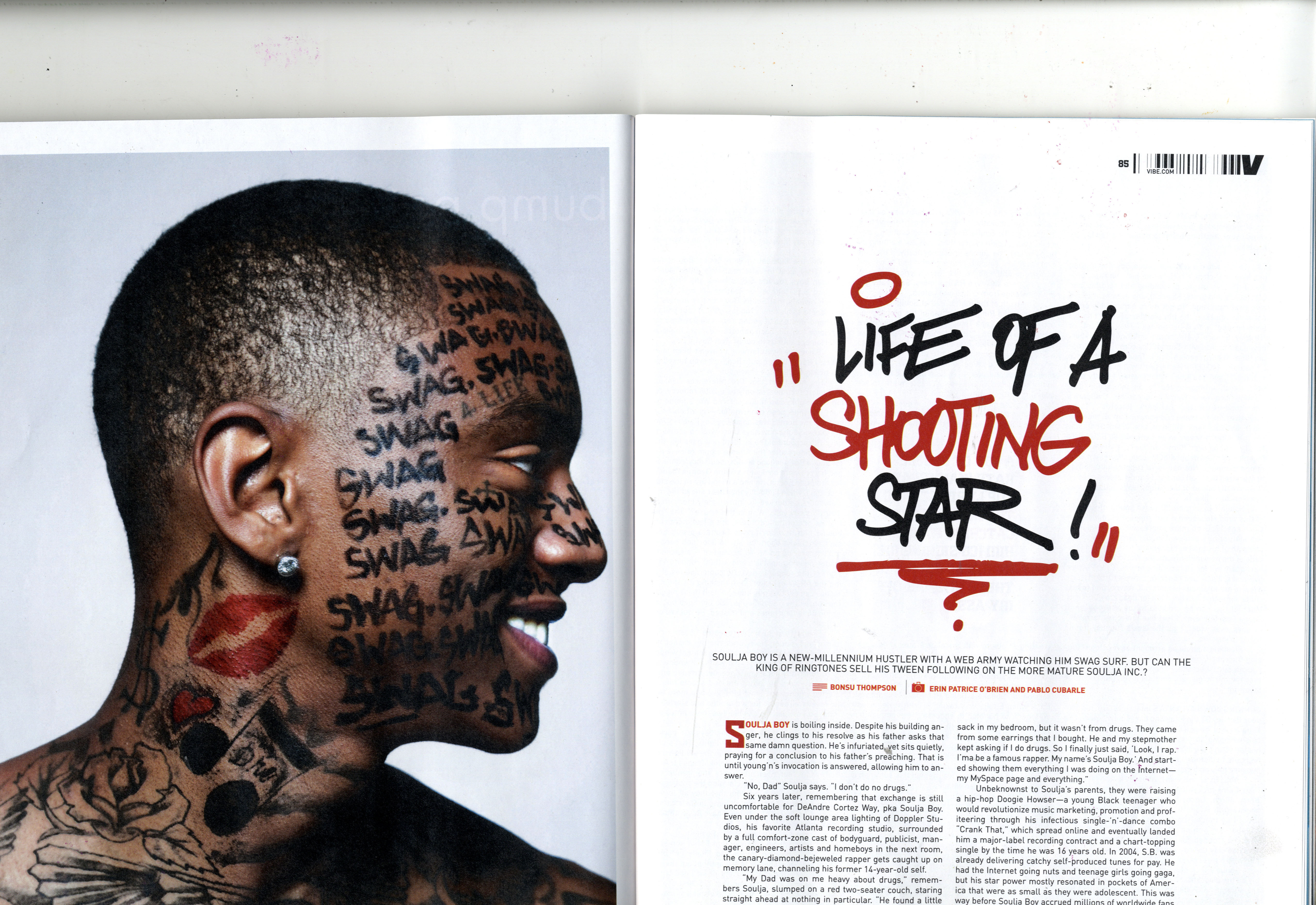
Main image
- There is often one main image: The image sometimes fills up a whole page, which is either on the left hand side of the page or the right.However the image can also fill the whole double page spread with the texts placed over it.
the images are always interesting to look at as the artists/models often have direct mode of address which makes the reader feel as though as they are going to have a personal informative connection with the artists whilst they read about them.
-sometimes smaller images are used in between the article to make the articles more appealing and interesting to read for the whilst they read through.
Headline
-The headline is often vague but rather intriguing as, they avoid telling the whole story through the headline, but they use emotive languages to gain the attention of the audience. For example the headline is often a pun which is often associated with the artist. This is used as a way of assuring the reader that the article will be interesting make them feel engaged in the article.the headline is also known to be a the largest piece of text on the page, this is to help the reader easily read and it is also used as a striking tool for the reader's interest.
Text/Quotes
-Quotes/"pullquotes" by artists are often used to break the texts on the page to make the article look more appealing and interactive to the reader.Drop capital is often used at the beginning of the sentences in the article to help the reader understand where the article starts.
Other techniques used for the same effect are: different font colour for the first line of the article, or the first line's text font being in capitals.
stands
-Double page spreads also have stands. This is an introduction to the article , as it briefly explains what the article is about. This is usually positioned beneath the headline and it often has the name of the artist which will be in a different font style, size and colour of the other texts on the page; although they follow through the colour scheme of the page.Layout
-The layout of the page links the two pages together to create a coherent double page spread.the layouts of the texts are often in 3-4 columns per page.
-The article is often informal as it contains the humour of the artist through their interview and the humour of the journalist. This is effective on the reader as they will feel engaged in the article.
-The first person pronoun is often used in the article.
The first paragraph of the article is usually very informative and intriguing as it plays the role of gaining instant attention of the audience.
-There is always a common colour scheme on the double page spread.
Examples of double page spreads


No comments:
Post a Comment